Physics Analysis of ROOT Output
Once a ROOT file with a tree including the ADC and TDC data for each event has been created, once can proceed to analyzer the data for a particular run. This is done with:
cd
cd analyzer
root
.x luterPlots.C(N) (this will run under root[0])
where N is the CODA run number.
This ROOT macro (written in C++) processes the ROOT data tree, and performs a series of calibrations and calculations for the setup in Luter 345. It also produces a series of 1D and 2D histogram plots, as documented in the next section.
Note about Plots[edit | edit source]
Some plots may be labeled incorrectly due to a mismatch in how tubes are stored in memory vs. how we intuitively order things. Be weary of plots being labeled as top when they should be bottom and vice versa. Fixing the labels will require reading and modifying the code used to generate the plots.
TDC raw fitter[edit | edit source]
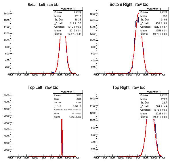
Numerous trials were run using only the TDC in order to properly configure it. Most of these trials were attempts to fix the timing and trigger so that the TDC would work properly with CODA. A macro was written to see the raw data stored in the TDC on all four of the channels. The four channels filled with raw data is displayed below.
Adjusted TDC spectra[edit | edit source]
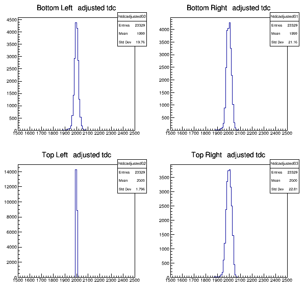
Then the data on all four channels had to be centered around a central point, in this case 2000, in order to get the other graphs to be uniform and correct. The corrected TDC data is shown here.
Raw ADC spectra[edit | edit source]
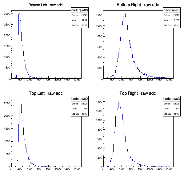
The ADC was then placed into the crate and setup properly with CODA. All of the ADC data in all four channels were placed into a graph in the same manner that the TDC was done. The raw data graphs are shown below.
Corrected ADC spectra[edit | edit source]
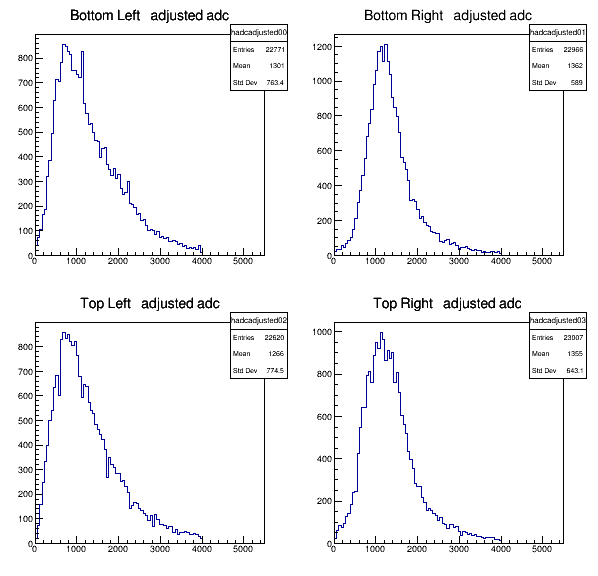
The ADC data was then corrected just as the TDC data was. The data was centered around the 1000 point range. The way the ADC plots are corrected is by using the pedestals from the raw output (fixed data points that result in the graph spiking when no pulses are detected) and the average of the data to determine a gain factor. This has the effect of eliminating spikes seen at the beginning of the data (near 0, refer to the raw data plots). This corrected data graph is shown below, along with the math used to determine the corrected data values.
$ gain={\frac {average-pedestal}{center}} $
$ correctedADC={\frac {rawADC}{gain}}-pedestal $
Top and Bottom Times vs. X Positions[edit | edit source]
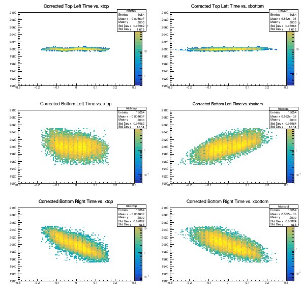
Shows trigger timing for when a cosmic ray enters the top and bottom scintillators. The x axis represents where the particle entered relative to the sensors / the middle of the scintillator. The y axis represents the time the detection was picked up by the sensor. As the bottom left sensor is hard-coded to include a delay in its detection, it results in a relatively flat line comparatively to other sensors. Particles that hit closer to sensors cause a signal to be generated quicker, which is shown on the graphs as a point lower on the y-axis.
Top and Bottom ADC Sum Overlays[edit | edit source]
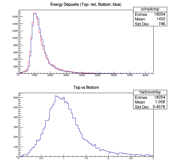
Energy deposited graph shows energy deposited in the top scintillator (RED) and bottom scintillator (BLUE). Top vs. Bottom graph shows energy deposition resolution.
Top and Bottom ADC Sums[edit | edit source]
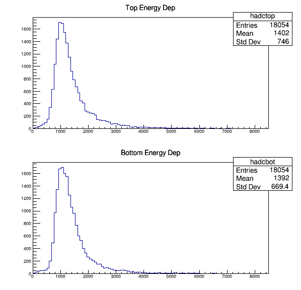
Shows Energy deposited in the top and bottom scintillators.
ADC vs theta[edit | edit source]
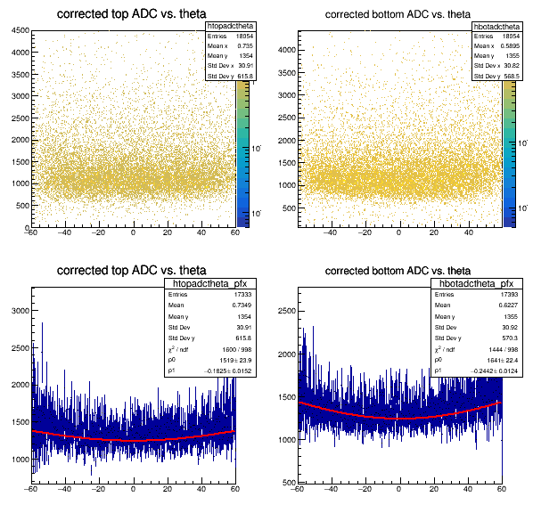
The final thing that was done was a two dimensional histogram was made comparing the top ADC versus theta. And a histogram was made comparing the bottom ADC versus theta. The graph is displayed below.
X Positions[edit | edit source]
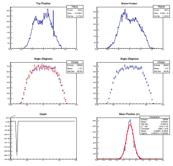
After this, the top right and top left ADC means were added together and then divided by two. This addition made the data based on two scintillators instead of the four photomultiplier tubes. Then, the angle was found in the experiment using the TDC data. An angle distribution of cosine squared was found. More angles seemed to hit toward the middle around the degree 0 than towards the edges. A graph is shown below.
ADC vs xpos[edit | edit source]
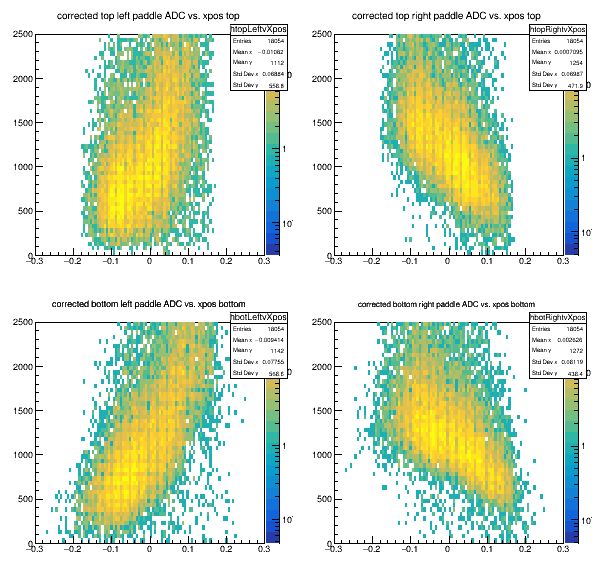
The next step was to make a two dimensional histogram of ADC data versus the position where the cosmic ray hit the scintillator. This graph was done for each of the four photomultiplier tubes. One for the top right, top left, bottom right, and bottom left. These graphs are displayed below. Particles that hit closer to sensors cause a signal to be generated quicker, which is shown on the graphs as a point lower on the y-axis.
