Luter Plots
Overview
Luter Plots has many iterations where each is an analysis script that gives around 10 cool plots. This page specifically covers the Jupyter Notebook version we made.
rdfluterplots is a jupyter notebook that takes a .root file containing cosmic ray data, analyzes the data using RDataFrame, and displays them using CERN's ROOT framework.
Script Usage
The Jupyter Notebook is located at this link: rdfluterplots
Input Run
Data for different runs is stored in root files label with the run number. For example, run 40 is saved to the file rootfiles/test40.root. So, by changing the filename variable in cell 2, you can select the run data you want to analyze.
Changing Functions
The program defines all of its functions in C++ and uses ROOT gInterpreter to make the C++ code accessible to the rest of the python script. These functions are mostly found in the third cell. Everything inside this trigger comment block must be written in C++ format.
Output Data
All the graphs are created using root TCanvas objects.
Raw Data Plots
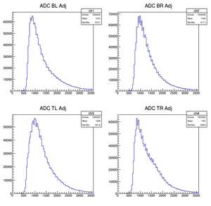
Canvases 1 and 2 simply plot the raw TDC and ADC values as a 1d Histogram. Each channel has its own subplot on the canvas.
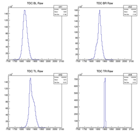
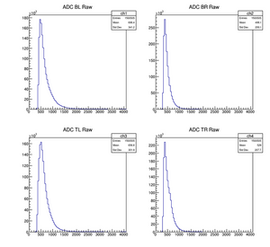
Notice how the TDC peaks do not line up and how the ADC data are all squished to the left side of the plot
Adjusted Plots
The program does some corrections to make the data better.
TDC Adjustments
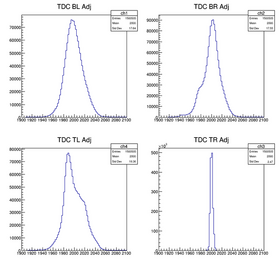
For the TDC Data, The program finds the mean value of the raw data for each channel then plots the data as so that all of the mean values are centered on the plot.
ADC Adjustments
For the ADC Data, it finds the pedestal value (these values arise from the voltage offset of the system) and takes an adjustment factor. To get the corrected data, it takes the actual value minus the pedestal then divides that by the average value minus the pedestal. That expression is multiplied by the correction factor to get the data to line up properly.
Plots
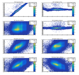
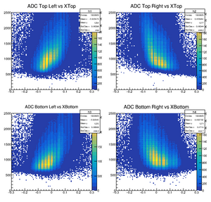
Canvases 3 and 4 display the adjusted TDC and ADC Data data.
ADC/TDC vs Xtop/Xbottom
Xtop and XBottom are both calculated by taking the difference between the left and right channel digital time signals divide by two, then this value is converted to a x position from the center of the scintillator.
For the TDC graphs, we expect to see them linear increase or decrease for the left or right channel respectively. This is because if the cosmic ray hits close to the left, you get a negative xpos, a smaller left time and a larger right time. As the position gets closer to the right the xpos increase, the left time increases, and the right time decreases.
For the ADC graphs, we expect a similar trend of increase or decrease for the left or right channel respectively; however, the slope is not as linear.
Ray Data
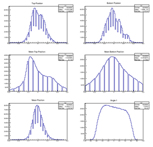
The top two plots show the calculated the x-position of where the ray strikes the top and bottom scintillators. The calculation of this is explained in the previous section.
The second two plots show the mean position of where the ray strikes the scintillator. When the TDC was adjusted, it was set so the channels would center around 2000; and thus, for this plot it sums the right and left TDC data and subtracts 4000 before converting the digital signal to a distance.
The Mean Position is just the mean top minus mean bottom all over two.
The Angle 1 graph shows the angle calculated between the top and bottom position.
Energy Deposition
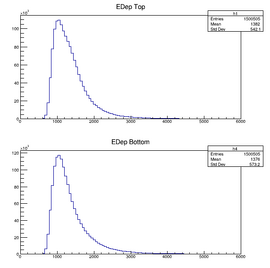
Canvas 8 shows the average of the ADC data between the left and right channel for each scintillator.
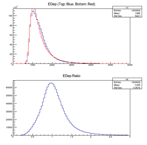
Canvas 9 is the graphs superimposed and then the ratio between the two energy depositions.
ADC vs. Theta
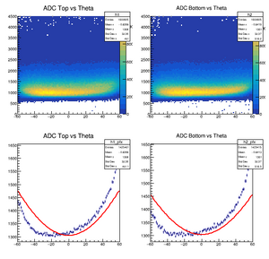
The top two just show the calculated angle against the ADC data. The value of these are expected to increase at larger angles since then the cosmic ray travels through a larger amount of scintillator.
The bottom two are the same graph as the top except they some error bars and a fit.
